When Graphic Design Was Fun: Hello Kitty, Chucks & the ’80s
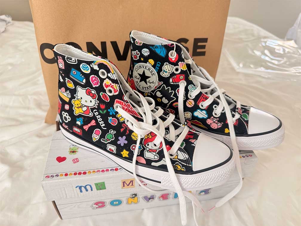
The sneaker landscape just got a massive injection of radical nostalgia. The official Converse x Hello Kitty and Friends Collection launched on March 5, 2026, bringing a heavy dose of retro energy to your shoe rotation. If your eyeballs are currently glued to the classic canvas high-tops plastered in an all-over sticker arrangement of Sanrio’s finest—Hello Kitty, My Melody, Badtz-Maru, and Keroppi—you are looking at pure, unadulterated 1980s layout philosophy. And beyond the nostalgia, what pulled me in is the design itself—bold, busy, playful, slightly chaotic and full of personality. In other words, everything graphic design used to be before beige took over.
The Street and the Sweet: How the 80s Built Two Icons
To understand why this mashup hits so hard, you have to look at who was rocking these brands when neon and synthesizers ruled the earth.The Converse Crew: In the 1980s, Converse Chuck Taylors weren't just basketball shoes; they were adopted by the thriving West Coast punk rock scene and early alternative subcultures. Bands like The Ramones, alongside countless underground skaters and grunge pioneers in the making, shredded the classic canvas silhouettes. They threw them on because they were cheap, durable, and looked inherently rebellious when paired with torn denim. The Hello Kitty Boom: On the flip side of subculture, Hello Kitty exploded into a multi-billion dollar western phenomenon during the 1980s. Why? Because the decade marked a massive shift toward consumer "kawaii" (cute) culture. The character became the ultimate form of personal branding for school kids and teens who collected Sanrio stationery, pencil cases, and plastic trinkets as a means of desk-side self-expression.
The Graphic Design Blueprint: Flat, Bold, & Maximum Fun
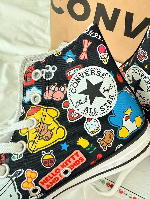
From a pure graphic design standpoint, the 80s was defined by a rejection of rigid modernism. It welcomed the rise of playful, illustrative maximalism. The artwork on the 2026 Chuck Taylor All-Star High-Top perfectly mirrors that visual era through three key elements:Thicker Outlines: This choice gives the characters a distinct comic-book feel and tactile weight.Flat Color Fills: With zero gradients, the primary bright tones pop cleanly off the dark canvas background.Sticker-Bombing: The overlapping collage layout mimics the chaos of 1980s sticker books.In the 80s, sticker collecting was serious business. Kids would trade puffy, scratch-and-sniff, and prismatic decals, completely plastering their school binders and skate decks. This sneaker utilizes a sticker-inspired design guide featuring heavy black linework, contrasting shapes, and floating secondary motifs like stars, music notes, and analog clocks. It fills the negative space exactly how a teenager in 1985 would have decorated their locker.
A Personal Design Philosophy
As a designer, this exact era is the anchor for my personal creative style. The unapologetic fun of 80s graphic design reminds us that art doesn't always have to be sterile, minimalist, or hidden behind corporate gray tones. Designs can be loud, character-driven, and highly expressive. Fusing the gritty, counter-cultural canvas of an All-Star high-top with the clean, joyful geometry of Sanrio's legacy shapes is exactly what inspires me to create. It proves that great visual design can evoke memories you didn't even live through, turning a pair of shoes into a wearable canvas of pop-art history.If you are looking to secure a piece of this nostalgic crossover, the collection is available directly through the official Sanrio Online Store or select retailers like Journeys. What specific era or subculture style do you normally lean into for your own design work? If you want, I can help you brainstorm color palettes or layout styles that capture a similar retro aesthetic for your next project!
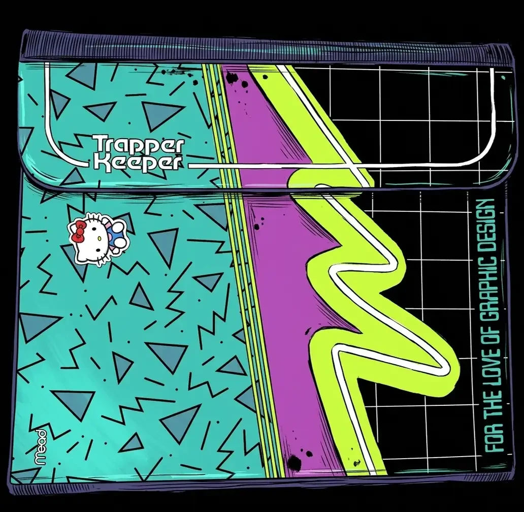
And for the record, I'm a huge Hello Kitty fan, so yes, I may be slightly biased—but can you blame me? Give me great typography, unexpected color, a little nostalgia and a design with an actual personality, and I'm in. That's the energy I love bringing into my own work: taking something familiar, giving it a fresh spin and making sure it doesn't look like everything else out there. So if your brand could use a little less beige and a lot more personality, I'd love to make your next design move with you. Trapper Keeper required.